Monday 30 January 2012

Review Draft Ideas By Holly King

Once again Freya Murdock has put on a heart-wrenching performance which has moved the hearts of many. There is a great element of simplicity in this short film, however the suggestive camera work by Holly King in combination with this 'A-List' acting is really effective.

Polly is a unique film which exposes and explores the life of a lonely, isolated young girl, who spends her days repeating the same tedious routines with imagination as her only friend and the toll this can take. It explores how isolation can lead to disconnection from reality, and how unexpected company disrupts this human contact deprived individual and her monotonous world.

Pink Penguin Pictures ™ have released another unpredictable, unique short film which has struck sentimental fondness in many viewers. Throughout the film, viewers connect with the girl and feel apart of her life, although there is no major crisis, this is a moving short film. The emotional trauma is subtle however moving as you feel you’ve connected with the girl. The climax of the film however was relatively disappointing and brief.

Review Analysis By Holly King

Before writing the review we had to look at current reviews (we used http://www.littlewhitelies.co.uk/ ) so we could analyse the content and order of the text and the different things they included in reviews.
Below is a review by Little White Lies on 'The Girl With the Dragon Tatoo'. I have analysed the review so that we have an idea as to how we should write our review and what to include and also try and use similar laguage techniques as those using in the reviews by this company (For example they use a lot of creative language, complex nouns, adjectives and metaphors).

I have done more work on designing the poster (as photoshop is something I am talented at), however English Lanuage is not one of my strong areas, and because Freya is completing an A Level in English, She has better Language skills and so this will be useful when writing the review. I will work more on the layout of the article.

  • Me and Freya have both looked at reviews and the review tends to open with Aknowledgements (In this example it is the novel)-Followed by other aknowledgements such as actors, director and so on.
  • This is then followed by a plot summary and then forks off to comment on individual scenes of the film and also the critics opinion.
  • This is then followed by a concluded review, as shown in the box at the bottom (This is sometimes in the form of a paragraph too).

Parargaph Review Analysis by Freya

This is just a quick look at how Little White Lies orders their reviews, so I can copy this layout.
This is how I've ordered my review so far.  As we can tell from this, I need to add more discriptions of specific scenes.


Review Draft by Freya

Just a first unfinished draft.
Polly
Holly King is back from her popular debut ‘Forgotten’ with kitchen sink drama ‘Polly’, an insight into the life of a lonely teenager who finds comfort online.  With realism that Mike Leigh would be proud of, the vignette takes us on a poignant journey with main character, 15 year old Polly, who’s pulled out of her isolation by mysterious Facebook friend Thomas Davidson. 

Polly is fresh, a modern tragedy that’s not only relatable but gives an insight into the dangers of social networking.  For a story that’s all set in one room, the journey is remarkably profound, every emotion shared between Polly and us. Despite little discernment into her past and present state of being, we can see the vacancy behind her non-socialite existence, one that Freya Murdock’s performance reflects with honesty. 

Although touching and emotion filled, in some scenes the story did lack entertainment, making it an effort to watch as the plot became somewhat messy.  The daily routine of Polly seems as equally boring to the audience as it is to her, which in a way is fantastic: we have an instant connection with Polly as we share her remorse.  But we've come to the cinema to be entertained, and it feels that here, something is missing.
Anticipation:              King is welcomed into the world of realism with open arms, a
                                    genre we hope she stays in. 2
Enjoyment:                Slight lack of entertainment, although worth the wait when the
                                    performance and storyline get going. 3                     
In retrospect:             Real emotion beautifuly conveyed, raw realism 4

Saturday 28 January 2012

Pre-Production Planning-Music Organisation by Freya

This is a brief outline of how I organised the tracks I found that I thought we could use for our film.  I brought them in on a memory stick and me and Holly went through the different choices.

Pre-Production Planning: Music by Freya

The music we used in our video was taken from the motion picture '500 Days of Summer'.  We did try using a soundtrack from GarageBand, but we didn't like the quality of any of the tracks and couldn't find one that really reflected the mood that we were trying to convey: this sense of deep sadness and monotony.
When we couldn't find one we decided to go on youtube and look for an acoustic piece, because lyrics usually didn't give out the right message.  After a lot of searching through different soundtracks of movies I found the one from '500 Days of Summer' by The Score.   There were about 20 soundtracks on youtube, all about a minute to three minutes long so I sorted through them all and picked out three that I felt really conveyed the different moods we wanted to show the audience through out the stages of 'Polly'.  Since the film is all about her; just a small clip of her life, we wanted our demographic to be completely in-sink with her emotions, and the music was a vital part of making this happen.
Monotonous, lonely days:
We used this twice in a row to reflect the similarity in her days, and how they feel the same.  The tune is very melancholy and downbeat, but gentle at the same time.
Used 0:00-2:30    Second time 0:00 - 1:28
Begins talking to Thomas Davidson:
In our film this the first sense of any excitement or happiness.  I loved this peice of music, it felt perfect but because it was quite short Holly copied the upbeat bit twice and put it in our movie, so it lasted the whole time while Polly messaged Thomas.
Used:  0:19-0:47 (repeated x2)
Twist Ending:
This is such a shock to Polly, and we wanted to convey the sudden sadness that the only thing keeping her happy was a lie.  The music here is very poignant in the saddest of ways, as certain chords are struck that emphasize her devastation.  This downbeat music continues through the credits to leave the audience with a real feeling of sadness and empathy.
Used:  0:00-0:35

We were a bit worried about copyright infringement as this is music off the motion picture 500 Days of Summer, but YouTube was fine with it, reinstating our film after reviewing the music.  We made sure to change the tracks slightly or only use parts of certain tracks as to not just copy a song fully.  

Thursday 26 January 2012

Film Poster Idea by Freya

I find photoshop very difficult to work with, so I just tried to make an idea for a poster, without the title and other texts.
The background is a facebook page, and the way she is displayed over the top suggests that the background is her whole life. 
The display photo is the same that Thomas Davidson has, although I added green and pink to it, not only because it's aesthetically pleasing but also because it reflects the bedroom walls we always see surrounding her.  I did this because it connotes this idea that Thomas becomes her whole life.
I changed Polly so that the image is very bright and highly contrasted, so she appears kind of dreamlike and pop-arty.  I thought that this gave the appearence that she is drifting away from reality.  The fact we can only see half her face but it's very close to the camera reflects the fact that the whole film is just about her, and that shes got two sides to her, one that's happy, but we only see the sad side.

Poster Deisgn By Holly King


This poster design is similar to other poster designs however I like how the character is looking at the screen -allows the viewer to empathise and conenct more with the character.

Wednesday 25 January 2012

Finished Short Film Polly: By Holly (UPDATED)

Our Short film was successfully uploaded to youtube and is in High Quality

Updated Final Short Film 'Polly'
With New Alternative Sound Track

  • The Video Above is the Short Film with a non copyright protected sound track. We origionally made our short film with a different non-diegetic sound track (As Posted Below), however there were some issues involving copy right and so to ensure there was no problems, I made a version using Royalty Free music.
  • As it was hard for us to meet up out of lesson time, I had to do all of the new non-diegetic sound editing. As the garage band tracks are limited, I had to look up royalty free music online (on sites the college had given us)- These were Jamendo and Incompetech .
  • I found 2 tracks (1 was a repetative orchestral sound track that runs throughout day 1 and day 2, and the other was a meloncholic, slow pianno track for the end scene).

Above is the Screen shot showing the garage band file I created once it was complete. Here you can see the variety of non diegetic and diegetic sound tracks I have used and also how I have had to adjust the volume of different layers at different points.


The 2 Tracks we used off Jamendo:
  1. Celestial Aeon Project- Hope for Rebirth
  2. Kero Dean- Falling
First Version of Short Film

Copy Right Issues with First Version:
  • There were however some Issues with the non diegetic sound track we used in our short film, the sound track we used was found on youtube which means it could have been copy right protected. Although we made several changes to try and avoid infringing copyright laws, such as using a combination of different sound tracks and editing these in garage band.
  • When the video was uploaded it was also temporarily removed, so youtube could review it and check that we were not using copyright protected music, however it was later reactivated-suggesting that we were not infringing copy right laws.

However We did decide to change the non-diegetic music tracks just to be safe.

    Poster Design Ideas By Holly King

    Design Idea:
    • I wanted to experiment with different allignments. Freya gave the idea of having half of her face on the screen and i think this works well.
    • All other content of the poster is the same as other designs-I have just experimented with using right justification of the text-to fit around the image.

    Poster Design Ideas By Holly King

    Poster Idea:

    • This is another poster I have designed on photoshop.
    • We decided to stick with a computer designed poster, as opposed to a hand drawn one-as I do not feel my drawings would be good enough and also there are more effects we can add by designing poster digitally.
    • This poster uses the cartoon text-doodle like.
    • I have decided to stick with the pastel colours of pale green and pink-as i feel this sets the correct mood for our film and is also significant as it is the colour scheme of her bedroom (in which the film is set).
    • I have decided to include both the slinky and the wind up toy in this poster design as they give us a clue as to what the film is about.
    • I have also included an image of the girl in the background-out of focus, to show her insignificance but also so we know who the film is about.
    • I have chosen to stick with central allignment, however this is something I will experiment with in different designs.

    Tuesday 24 January 2012

    Short Film Polly

    We have been unable to upload our video to you tube due to technical constraints. Our origionally finished film was too large (as we had a lot of data and filmed in HD), so we had to convert the file to a different format to reduce the amount of memory it used/size of the file.

    However I have been able to upload our finished Short Film to the bog. However it would appear it has lost some of its quality during the process.

    Polly:

    Monday 23 January 2012

    Poster Design Ideas By Holly King


    Poster Design:

    Here is another poster I have designed using images from the photoshoot and font from 'www.dafont.com' . I created this image on photoshop- the images of Freya and the slinky are from the photoshoot-and the background was created in photoshop.
    • In this design I decided to stick with using pastel colours, to create the mood of the film and show the simplicity and innocence of the girl. I decided to keep the simplicity by not using too many different colours (stuck with yellow, green and pink pastel colours).
    • I chose to stick with central alignment in this poster too, as i feel it works best with the image and background. It also draws your attention into the centre.
    • I thought to have the slinky across the top of the page, as she is looking up at it and also it is significant to content of the film-showing the boredom of the girl.
    • Her body language and facial expression in the image also suggests she is bored.
    • The doodle text and pastel colours indicate her youth and personality and gives us an indication as to what mood the film will have.
    • I also created the production company logo in photoshop, which i included in the poster-to familiarise people will the production company.

    Short Film By Holly King

    Finishing Editing:
    • We finished editing this morning- We finished off adding the Foley sound Effects and we decided to replace the song track i used, with a combination of different tracks that Freya brought in today-as we felt the variation of the non diegetic sound track worked better with the different moods, rather thank just using one sound track.
    Problems with uploading film:
    • We uploaded our film at 11.25 this morning to youtube, however for some reason the sound has not worked-this is a link to the short film we uploaded- http://www.youtube.com/watch?v=2Ql6OVu5wKk.
    • Thankfully I copied to file to my USB stick and am currently reattempting to load our short film with the sound-to youtube. The file i have appears to be lower quality however this may just be a technical problem and if needs be we can upload a high quality version at college tomorrow.
    Screen Shot:
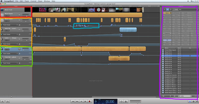
    • Below is a Screen shot of our garage band file-with completed movie and sound editing.
    • The Red Highlighted row shows the movie file and the audio of the movie file-as you can see there is no sound on this file-hence why we had to add all of the Foley sounds.
    • The Orange Row shows the 3 rows our diegetic Foley sound effects were spread over. We needed different row so that different sounds can play at once/overlap. Here you can see the amount of different Foley sounds we used.
    • The Green highlighted row shows the 2 rows we used for the non diegetic sound tracks. The music track on the top row are the melancholic, more relaxed tracks. Whereas the 2 small clips of music on the bottom layer is the upbeat music.
    • The Blue Highlighted area shows how I had to adjust the different volume levels at different parts of the film (for example I didn't want the footsteps to be too loud, so i lowered the volume level at this point. This was also used to fade out the non-diegetic soundtrack.
    • The Purple highlighted area shows how we found some of the Foley Sounds we used-by searching for a specific sound or choosing by category, you are able to find the sound effects you want.

    Stop animation Sequence By Holly King


    • This 6 second lond stop animation, is made up of 50 different images.
    • The images needed to run is such quick succession so that the unicorns looked like they were moving.
    • We decided to experiement with stop animation in our short film to show how lonliness and isolation can lead to things becoming surreal and dream like.
    • To create this sequence we had to insert all the files in the correct order-then export them as a movie file. We then reinserted this into final cut pro, into place on the short film. By right clocking on the file we were able to change the suration of the sequemce-to make the different images move quickly (origionally each image was 3 seconds long).
    • We both worked on the stop animations in the editing process.

    Saturday 21 January 2012

    Poster Design Ideas By Holly King

    Poster Design Idea:

    This is a poster design I have created using images from the photo shoot I took and Text from 'http://dafont.com'. I designed this poster on adobe photoshop.

    • I chose to stick with the idea of the pink and green background-as this is used in the film (the location of the film-her bedroom)-where all of her time is spent.
    • The coloursplit of the background can also symbolise her disconnection with reality and confusion between reality and fantasy.
    • I decided to stick with the idea of handwritten/doodle text-as doodling is also something often linked with boredom-it also can show the innocence of the girl.
    • I used a 'stamp' effect on the image of the girl-this was initially to look like a drawing/look surreal, however i feel it looks too dark and does not portray the type of film we have made.
    • The simplicity of the poster is significant, as it shows the simplicity of her and also the emptiness around her/her isolation and disconnection from the world.
    • I used white text, so that it would stand out from the background.
    • I feel this design does not portray our film style correctly and is also too dark-i will create a new design, with a more colourful mood. I may also try to include the different props (such as the slinky and wind up teeth.
    • I used central allignment in this design-i think this is effective-especially because of the split colours of the background being central.

    Editing By Holly King

    The deadline for completing our edited short film was Friday 20th January, However we were unable to fully complete the short film by this deadline due to constraints.
    By Thursday 19th, We had completed all visual editing in final cut pro and planned to complete all the audio edit on garage band by 4.10 on the Friday, however we were unable to. I have done all of the sound editing so far, however there is still more to do, which will be completed by myself and Freya on Monday.

    Freya was unwell and unable to come in on Friday, she had the non diegetic sound track we planned to use on her USB stick, so I was unable to access this whilst editing on Friday, and so had to spend time searching for an alternative track-which limited my time for editing the audio and adding Foley sounds.

    By the deadline at 4.10 I had managed to add an alternative sound track and also add several of the Foley sounds, however it is still incomplete. After talking to Marion, we have been allowed more time to complete the editing on Monday 23rd January.

    Below are some screen shots showing some stages of the sound editing process:

    •  Above shows a screen shot during the editing process. Here you can see the bottom long orange bar, which is the non-diegetic sound track. The small orange bars are foley sound effects (Such as Footsteps, opening of the blinds, draw opening and so on).
    • As you can see there is a pale blue line underneath each of the orange bars-this line allows you to adjust the volume level at different stages (so for example if the footsteps are too loud, I can lower the bar at that point to make it sound more realistic).
    • The side bar to the right of the screen shows where the sound effects can be found, by selecting certain catagories, it refines the search results to what you are looking for.
    • The side bar to the left shows the different layers of sounds. (so different sounds can be overlayed-so the non diegetic sound track can be played at the same time as the foley sounds).
    • Screen shot shows how I converted some audio, so It could be edited in garage band.
    • Some sound effects we needed, I could not find on garage band (such as the slinky sound), and so instead of re-recording these sounds, I was able to convert the origional clip into an MP3 format using conversion software-so that I could just insert the sound and not the footage.
    Overall we have worked hard on our shortfilm and am confident we will complete it fully on Monday.

    Tuesday 17 January 2012

    Photoshoot By Holly King

    Today during our lesson, we also did a photoshoot for our poster design. I took the photographs and Freya was the model in them (as she is the character in the short film).
    When we decide on the layout and design of the poster we will create in on photoshoot by using different photographs from the shoot.

    Editing Proccess by Holly King

    We have been working in the editing suite for many hours since we finished shooting our short film. We took over 400 shots and so there was a lot of footage to look through and this was very time consuming.
    Today we have finished editing all of the footage (e.g cropping shots, rearranging footage, adding video effects) on Final Cut Pro, However we still need to complete the audio editing (this will be done using garage band).

    Here are some print screens of different processes/stages throughout the editing process so far:

    • Here is a screen shot showing how we added Video Filters to the Shots that needed colour adjustments and other filters added. We used on some of the watch shots and also used colour filters on shots of the computer screen when the white balance was off (screen was blue).
    • Here is another screen shot showing the filter settings we added to some of the shots of the watch. We had to change the colour filters because the colour of the shots of the watch did not always match the time of day. So we had to darken and change some of these shots to match the time of day and colour of the shots that followed.

    • When making the stop animation of the unicorn we had to open a new final cut pro, insert all the images of the unicorns in the correct order and export this as a finished movie file. We then had to import this into the short film final cut file. Because the shots of the unicorns in the sequence were too long (so it did not run smoothly), we had to shorted the duration of the file (as shown in the box above), so that the sequence would run quickly and look like the unicorns were moving.
    • This was useful as it would have taken longer for us to have cut down each of the shots of the unicorns and so it made the editing process quicker for us.
    • Above is a screen shot showing all of the footage in order after we had finished editing.

    Editing by Holly and Freya

    17th of January
    We've literally just finished our editing on Final Cut, but we still need to add folley and non diegetic soundtrack on GarageBand.  We plan to do this on thursday on the double period if not sooner. 

    Monday 16 January 2012

    Editing by Freya

    16th January
    We're continuing to edit and have nearly come to the end so all we need to do now is transfer a copy of our film to Garage Band and do the sound.  We need a background track, and we've looked at this one as an idea: Do You Think There's a Heaven-extended version feat Niall Patterson.  Since this track is an 'extended version' that was completed by a member of youtube I think that it won't infringe copyright laws.  It's an acoustic downbeat track, that I think really reflects the feeling of boredom and loneliness in our main character.  As it's only two minutes along we'll need another or longer track to go with our film.
    Our editing has gone quite well, we've had some trouble with the lighting on some of our shots which we've filtered to look better, and our film is over the time limit by about a minute, so we'll have to go back through our film and shorten or delete certain unnecessary shots.  We've had a few continuity errors, for example in one shot I'm putting on a watch and in the next shot the watch is no longer there, which has made things complicated.  Luckily we had so many takes of every shot that there are many slightly different versions, and we can usually find one that makes the continuity work.

    Thursday 12 January 2012

    Story Board By Holly King

    I have drawn a story board for our new short film idea-with annotations as to what is happening in the short film.


    Drawn by Holly King

    Poster Design Ideas By Holly King

    Poster Design:

    • This poster design was also one i drew and then scanned in and edited on photoshop. If we decided to stick with the cartoon effect-we could create our poster on adobe illustrator as this is good software for cartoons (as it works as vector images).
    • The orange box along the centre at the top-will be where the film title will be placed
    • In the 2 blue boxes either side of the girl will be information about the film (such as actors, credits, film website, release date e.t.c). Alternatively I might put the release date at the centre at the bottom of the poster.
    • The purple/dark grey boxes, would be where i would place the reviews.
    • I think that it is important to keep symmetry in the poster, as this is more aesthetically appealing.
    • I have also decided to use pastel colours in this poster design-as these are colours often associated with young girls and also shows innocence and sweetness.
    • The image i chose to use is a scene from the film-in which the girl watches a wind up toy to amuse herself and pass time. This gives us a hint to what the film is about.
    • The pink and green background colours are the same design as the wall in her bedroom (where most of her time is spent).
    • The pastel colours also give us an indication as to what the genre is/what the film will be about-and we can tell this is not a thriller or action film and is not negative. This is so it will appeal only to its intended audience.
    • The emtptiness of things in the frame and simplicity is also relevant as it tells us a bit about her life-not much going on and quite empty. 

    Poster Design Ideas By Holly King


    Poster Design:
    • Above is a poster design I have drawn. I then Scanned it in to photoshop and added the colour.
    • The poster design is rather simple and has a lot of empty space to the side of the girls face which could be used to write reviews in.
    • The poster has symmetrical central alignment, to increase aesthetic appeal.
    • The design of the two colours either side of her is the colours and design of her bedroom-in which the majority of her time is spent in.
    • I could also add doodles in the empty space, to express her boredom and how she passes time.
    • The blank boxes to the left, is where i could add the release date and the website of the film.
    • The box on the right is for the film credits to be placed.
    • I have chosen a simple design, as i feel these can be just as effective and also i feel it works with the narrative of the film-showing there is not much going on in her life.
    • There is a slinky positioned over her head-this curves around her head and also shows how she passes time (slinky is object associated with boredom).
    • I chose to use pastel colours, as i feel this suits the mood. The film is not a negative, dark film, and also i feel these colours show the innocence and sweetness of the girl-allowing us to empathise with her more.
    • In the design she is looking up at the text-so show she is bored.
    • The choice of the text 'bored.com' was used because the film is about her lonely, repatative life and the .com is because the centre of the story envoles the social networking site facebook.
    • The text is also drawn in a doodle like way-as doodling is also something that is associated with being bored.

    Wednesday 11 January 2012

    Poster Research By Holly King

    28 Weeks Later


    Genre/Representations:
    • The film poster has a red background colour-which indicates to us that this is a horror film,as the colour red is often associated with danger and death.
    • There is also a biohazzard symbol in the centre of the screen. This symol is used to indicate to us that there is something that can infect people/ a biological hazzard-suggesting danger indicating to us this is a horror film.
    • Also a review at the top, centre of the page reads in a large font that it is a 'zomie horror film'-this gives us a rough idea as to what the film is about (as the images are not too revealing).
    • There are also large, yellow, piercing, glowing eyes in the centre of the screen-staring into the camera-this in itsself is scary and also gives us an insite into the mutants/zomies in this sci-fi, horror, thrilller film. Its evil, piercing glare suggests these are dangerous, aggressive creatures.
    • The way in which we only see the zombie eyes is also significant as it is only revealing to us the eyes-creating enimgma and an element of mystery around these creatures-indicates to us it is a thriller.
    • The scratch marks on the poster also add to the dark mood, adding an element of violence to the poster (as scratching is something the zomies do in the film as part of their aggressive behaviour).
    • The use of the colours, red black and white is good as these are all colours linked with horror/terror/fear. The black silhuettes and text signifies darkness.
    Audience:
    • The content of the poster will appeal to people who enjoy horror/thriller films, as the poster represnts it as this genre.
    • There is also a film review on the poster and reviews on other posters from different magazines/newspapers. The news papers will be well known and appeal to the same audience.
    • Also at the top of the poster there is text that reads 'From the director of Trainspotting and The Beach'. This is important as people who enjoyed films directed by Danny Boyle (such as those listed), may then also watch this film.
    Narrative:

    • The poster does not reveal to us too much about the film. The review tells us it is a zombie Horror film. Also from the image at the bottom of the posters, shows big ben and the houses of parliment (well known landmarks of London), so we know the film is set in london.
    • Also there is a man walking alone in the bottom black image-and the yellow eyes overlooking the silhuette-Maybe suggesting he is being watched by something.
    • On an alternative poster, instead of the film review there is the text (as shown to the right). This gives us an idea to the narrative and events in the film.
    Film Language/Mise En Scene:
    • Only Uppercase letters are used on this poster, to show the importance of the text and make the words stand out to emphasise their significance and show the intensity of the situation.
    • There is also a tagline on the poster saying 'Your days are Numbered'-suggesting death and devistation and giving the impression of a battle for survival.
    • There is also a release date at the bottom of the screen, so people know when the film is to be released.
    • The website www.28dayslater.com is also placed on the poster, so people interested in the film can look online for further information about the film.
    • The text is aligned centrally, to fit around the images. Also maintains symmetry and increases aesthetic appeal.

    Tuesday 10 January 2012

    Poster Analysis: Made in Dagenham by Freya

    • The poster of 'Made in Dagenham' reflects a fun, historical drama.  Sally Hawkins is central and very big, not only reflecting her role in the film-the fact that she's the main character but also the fact that the woman she is presenting is such a big character, and such an important one in history.  Sally Hawkins also adds some star quality to the piece, her fans will be attracted to this film because of her starring in other British films like Happy go Lucky.
    • The cast list, although in a thin, gray font, is quite central because of its placement and size.  This again shows the importance of British star quality in Made in Dagenham.
    • Her costume is a very important.  The red coat signifies her as passionate, feisty and brave, as well as not afraid to stick out.  The skirt of the coat is above her knee which reflects that change at that time in history; skirts beginning to rise as women gained power.  Her haircut is iconic; a very stereotypical style for women in the 60s.  Her stance (arms crossed and legs apart) reflects both femininity and strength, which very much reflects the narrative; a story of women having to be strong and fight against the odds.  Her facial expression is a big smile which is again giving out the idea that the film is very enjoyable and happy.

    • The title is very 60s, it looks a bit like a newspaper font with the 'M' giving it a fun twist.  This could connote the narrative as a true, historical event being told in a fun, kooky way.  The title is the biggest text, as it's most important as the title of the film.  The second largest text is boasting 'From the director of Calendar Girls'. This is to prove the director is excellent, and also attract the same demographic, as I think the audience for Made in Dagenham is a very similar one to that of Calendar Girls; a middle aged to older audience.
    • The image in the background looks very British, with the car and the style amongst the women.  The British quality is quite important here, as 1960s Britain is a very big part of the film.  The bright colors of the dresses connote fun and liveliness.  The sign they are are holding is a very useful prop, connoting humor and a certain cheekiness to the text.  Only one man is on the poster while six women are shown, now only showing the dominance of women in this film but also to attract the audience who are predominantly women.
    • The tagline places the film immediately: 1968.  This emphasizes the importance of the date, and the historical genre of Made in Dagenham.  It also gives away the narrative, telling us this will be out the fight for equal pay and gender equality in Britain, so people know if they will be interested in this or not.  The '...' at the end of the tagline leaves the audience hanging, wanting to know how this woman will conquer the 'man's world'.  

    Poster Research By Holly King

    Tamara Drewe


    Genre:
    • The colours suggest this is a romance/uplifting film (colourful bright yellows and red). Her top is red-as is the text, indicating this is a romance film, as the colour red is often associated with romance/love.
    • The high saturation and variation of bright colours indicates to us that this is also a happy, comedy, uplifting film.
    • The Realistic scenario that is represented in the poster, also indicates to us that this may be a drama.
    • The characters also indicate that this is a romance film. There are only 2 characters in the frame-and the body language and facial expressions of the girl and the representation of the male character in the background, suggests there is chemistry and romance between these 2 characters which is to develop in the film.
    • The fact there are only 2 characters in frame, suggests they are the main focus of the film-backing up the idea of this being a romance.
    Representation:
    • The female character (Tamara), is dressed to appeal to men. Also her body language shows she is flirtatious. She is dressed in short-shorts which show off her body, she is also wearing a tight vest top, which also shows off her curves.
    • She is also a slightly larger women, to show that not all stereotypically attractive girls have to be skinny-and to show the beauty of the bigger, more curvaceous girls.
    • Tamara is not dressed up to appeal to men, the film is ment to show her as a naturally, attractive, country girl, wearing basic clothing and natural hair and makeup.
    • The male character is also a stereotypically attractive, young, muscular, country boy. We can tell he is muscular and ment to appeal to the female audience because in the photograph, he has is topless and has his shirt off and flung over his shoulder. He is also holding a tool (mallet) to show he is a strong man doing manual work.
    Audience:
    • On the poster it states that the film was based on a novel by Posy Simmonds.This will mean the film will apeal to people who have read the novel or other novels by Posy Simmonds.
    • Also there is a magazine review at the top of the page from 'Time'-this would be a magazine that would have a similar target audience to the film and so appealing to the correct audience.
    • From the mood and content of the poster-we can gather that it is a romantic drama-and so people who find these genres appealing will be attracted to the poster.
    • It also says 'A film by Stephen Frears'-this may appeal to people who have seen other films by Stephen Frears.
    Narrative:
    • The fact the female character is in the foreground of the film and the male character is only in the background and out of focus-gives the impression this film is a drama, and the female is the main character-and the film is about her journey in life and about her developing a relationship with the male character.
    • From the Mise En Scene, we can see this is set in the countryside and about the people who live there.
    Film Language/Mise En Scene:
    • There is a website address at the bottom of the page-where people can go if they want to find out more about the film.
    • There is also a block of texts with the film credits in-this is important to include in poster becuase it gives credit to those involved in the film.

    Poster Analysis: The Kids are All Right by Freya

    • The poster for 'The Kids are All Right' reflects a light, happy family drama.  The use of colour in the title; the baby yellow against a sky blue connotes a summery, beautiful atmosphere. 
    • I thought that the demographic here could be younger to middle aged women, which is suggested by the actors used.  Written in the largest writing (apart from the title) are the names Annette Bening and Mark Ruffalo.  Annette Bening could interest this demographic because she's of a similar age group.  The target audience could also be lesbians because they are rarely portrayed in the media, let alone so honestly without the use of obvious and insulting stereotypes.
    • The title, review, actor list and tagline are all written in capitals.  This shows importance and grabs the readers eye more.  The actor lists font is very big, maybe because it's showing off such big actors like Mark Ruffalo and Annette Bening. The way the title, review, actor list and tagline are layed out is very aesthetically pleasing, a pattern of black and yellow. 
    • The review reads that The Kids are All Right is 'funny, smart and sexy!  This pitch perfect movie charms audiences into a state of enlightenment.'  I think that this review would attract a middle aged demographic as it talks of 'charm', 'enlightenment' and 'sexy'.  The mention of 'sexy' makes the whole thing sound a bit more exciting and racey, while 'charm' and 'enlightenment' reflects a classy, individual, beautiful story.
    • Unusually, the main characters of this film are not a central image, they only take up about a quarter of the frame and are posed extremely naturally, their body language and facial expression reflecting this.  This could reflect a kitchen sink drama type of genre, where the narrative is far more realistic.
    • The scenery in the background is stunning, a spread view connoting freedom and life.  This could suggest a narrative full of abundant life and beauty.  The fact that the characters seem to be resting above all this splendor could suggest how rich with life they are.  
    • The characters are represented as a family, and the tagline hints at what kind: 'Nic and Jules had the perfect family, until they met the man who made it all possible'.  Nic and Jules are lesbians, but aren't represented as stereo typically as this minority group usually is.  Through costume, hair and makeup they are represented here as very 'normal' women.  Both of their costume involves just a casual plain top.  Nic's hair represents her in a more stereotypical way by having a shorter hairstyle.  
    • The tagline uses a cliffhanger technique, like most posters do.  It gives away that their sperm-doner disrupts their family, but we don't know why or how, making the audience wish to know more, and thus go see the film.

    Thursday 5 January 2012

    Pre-Production Planning: Camera Work and Mise En Scene By Holly King

    Camera Work:

    For our short film we will be experimenting with different camera work, a few techniques being:
      Example of canted shot
    • Canted shots-This is to show the female characters disconnection from reality and how loneliness can lead to things becoming distorted.
    • Panning-As with all of our previous work, we will use panning shots-to follow the characters movement and it can also be used to set a location.
    • Tracking/Dollying-It is often hard to create devices which allow you to track smoothly, however we will experiment (could use a wheelie chair), as this is a good way to follow a character and also home in on them in a more creative way (as opposed to zooming)-it also makes things more realistic for the viewer, as if its their point of view.
    • 
      Example of Shallow depth
      of field-Allowing us to
      focus on important things.
      
    • Stop Motion Animation-We intend to experiment with stop animation in our short film. This is where we will take a series of images, which when played in quick succession creates movement and allows things to become animated. We will try this when the girl is playing and bring her toys to life, to show how loneliness can cause a disconnection from Reality.
    • Depth of Field-We will experiment using a shallow depth of field in this short film and adjusting the plane of focus, to focus on different thing, as we felt this was a successful technique in previous projects.
    • Match on action-This is important in Continuous editing (if something is running in a smooth squence) that match on action is correct. For example is a person is opening a door with their left hand in one shot, in the following shot they must be using their left hand to open the door too.


    There are several areas of Mise En Scene that have to be considered while planning and Filming. These areas being:
    • Character Position/Composition
    • Props
    • Costume
    • Hair
    • Makeup
    • Lighting
    • Setting
    • Colour
    • Decor
    • Location
    -Character Position/Composition- Before each shot, we need to plan the positions of the characters and other elements in the frame to ensure everything that is necessary is in shot, in the right place.
    -Props-We have planned which props we will use in our short film on the link.
    -Costume, Hair and Makeup-There is also a link to the costume design, hair and make up for the character in our short film.
    -Lighting-The lighting in our short film will remain the same as planned for in our previous idea.
    -Setting/Location-The Location of the house in which we plan to shoot is on the link to the left. The whole short film will be set in one of the bedrooms of this house, which is ment to be the young girls bedroom. This is to show her isolation and antisocial way of living, because she never leaves her bedroom.
    -Colour-The shots will be filmed in natural colour, we may add filters during the editing process to add effects (give the impression of night time so darken the shots) however we intend for our film to be published at a normal hue/saturation.

    Pre-production Planning: Facebook By Holly King

    • For this project we made 2 temporary facebook accounts for the 2 characters. These accounts have now been deactivate, however were needed for the filming of our film. Above is a Screen Shot of the character 'Polly Evans' Facebook account.
    • We chose to make a facebook account as this it will appeal to the target audience of our short film (being teenagers)-and so they can empathise with the character more and also it is something they are familiar with, as social networking sites (such as facebook) play a big part in the social life of young people in modern day.

    Pre-Production Planning: Our Story/Narrative By Holly King

    The story shows the girls dailey routines over a period of 3 days and how her normal boring routine is disturbed.
    • The First sequence of shot shows the girl waking up in the morning and getting dressed (These shots run in quick succession)
    • The girl then checks her facebook account and has '0' Friends-the girl looks sad however continues with her day
    • There is then a shot of her watch reading the time-this then fades into another shot of the watch showing a later time (by an hour or so)
    • There is then shots of the girl fulfilling activities to keep her entertained (such as reading a book)
    • following this there is a repetative sequence of shots showing time passing again and her doing more activitys. This is to emphasise her lonely and uneventful/uninteresting days
    • In the evening the girl goes to sleep, and wakes up the following morning, repeating the same processes as the previous day (to emphasise the repetativeness of her routine)
    • Throughout the day similar events take place as the previous day and once again we watch the time pass by on her watch
    • In the evening however, she unexpectadly recieves a friend request on facebook from a young man (She does not know however she is happy to have company)
    • She then starts talking to this boy and is happy to have company
    • The following morning she wakes up early and happy (unlike her usual routine), she is excited to talk to the boy and does not get changed as she would normally. Instead she jumps up to talk to the boy online
    • However when she opens her facebook, she reads a message from the boy saying 'sorry I thought you were someone else'
    • She checks her friends and once again has '0' friends
    • The girl is sad however returns bacl to her normal routine

    Pre-Production Planning Script By Freya

    Internet conversation on Facebook email, between Polly Evans and Thomas Davidson:      

    Second Day:
    Thomas Davidson:          Hey, nice profile picture :)
    Polly Evans:                    Thanks, how do I know you? :D
    Thomas Davidson:          I've seen you around college
    Polly Evans:                    Oh :) what are you doing?
    Thomas Davidson:          Just listening to the vaccines and   talkin to you
    Polly Evans:                    I love the vaccines!
    Thomas Davidson:         sweet!
    Polly Evans:                    [Do you wanna hang out?<3] deletes and writes something else: cool :)
    Thomas Davidson:         I g2g, maybe I'll talk to you tommorow?  or we should hang out sometime.
    Polly Evans:                 Okay :D

    Last Day:
    Thomas Davidson:      Sorry, i thought you were somebody else' 

    Wednesday 4 January 2012

    Pre- production planning: Story Idea By Holly King

    We were unable to film our origional story idea due to not having enough actors avaliable to film. We tried to adapt our idea so that we only needed one actor however we were unable to do so, so we decided to think of a new idea.

    Origionally i thought of a short film about a girl who is lovely, bored and deprived of human contact, the story is:
    • About a lonely girl
    • She has the same dailey routines alone in her room
    • She regularly Checks her Facebook page, which shows her having no friends
    • Thoughtout the day, we see smalls clips of her being bored and alone, showing us what her days consist of and how she entertains herself
    • There are 3 days in this shortfilm-the first day shows us what she does everyday
    • The Second day shows us how her routine repeates dailey
    • However in the evening of the second day, she recieves a friend request from a boy she does not know, however she is overwhelmed that she has a friend and somebody to talk to
    • The 2 talk into the night and find out they have a lot in common
    • The 2 arrange to meet up the following day
    • The girls usual routine is disrupted as she excitably wakes up early on the 3rd day to meet this boy
    • She waits where they arrange to meet, however noone comes
    • When she returns home she checks her facebok page to ask boy where he was
    • However she has no mail in her inbox (no previous messgaes-as if the conversation never took place)
    • She also once again has no facebook friends
    • She searches the boys name in the search bar and there are no results found
    • She feels sad and lonely once more and returns back to her usual lonely, boring routine.
    I felt this idea was good because it links with out first short film idea and the idea of someone being so lonely that they imagine company. However after discussing this as a group we decided to adapt my origional story slightly.